Tuesday, October 30, 2012

Sites for Art

Today was a bit drizzly, but a great day to go out and check out the different types of art works in down town Meadville.

My first newspaper stand while making my walk to sites where art is shown in Meadville. The design of this newspaper stand has a radial design in the front.  

As I was walking into town, this sculpture caught my eye. I liked the straight edges of this sculpture and the different looks from each angle of the sculpture.  

This is a mural I found in town in Meadville.  

I would paint a long mural on this brick wall, if I head paint with me at the time. I would like to paint a story onto the wall. I think it would be interesting to walk and visually see a story unraveling as your walking to one place to another.

I found this to be a weird design on a newspaper stand compared to the other one I have seen. 

I personally do not like this design for a newspaper stand. I find it a disturbing image to look at.  


This reminded me Rome's Trevi Fountain.  I would like to see sculptures and a water falling from the curves on top.  

I loved the light reflecting on the water and the fluidity of it.  

The Meta Mash sign. 

I liked the alien graffiti and I also believe in aliens. Haha 

Quaker graffiti. This reminds me of Banksy because of the stencil look it gives off , which is similar to Banksy's graffiti. 

Another cool design on newspaper stand.

If I had this bench as a location to put up my art , I would sculpt a woman sitting while holding an umbrella over her head.  

Municipal Parking Garage in Meadville.

I was under this tree and looked at the parking lot and I had to get a picture of this work at this angle. The tree gave it a cool effect and the organic shapes the leaves had were similar to the wavy shapes on the parking lot.

Sunday, October 28, 2012

Collage


Our next assignment was to make multiple collages and make them relate to one another.  I started off a bit lost.  I did not know how to start a collage or what materials I should have used.


The first step was painting these planks of wood with black acrylic paint.  For the holes that were made before, I used  tape to cover them and paint it over with black paint.  


In the process I used images and arranged it to the way I envisioned it.  I used the color appropriate string to bring everything in together.  
The final outcome of the collage.

I personally was not satisfied with what I made.  Altogether, they do not look balanced.  If I were to change anything I would go back and more planks of wood for the left and right collage.  There is not enough details for the left and right compared to the one in the middle.  And I would want to rethink of how I wanted to rearrange them to make them look balanced and whole.  

Saturday, October 6, 2012

Object Transformation

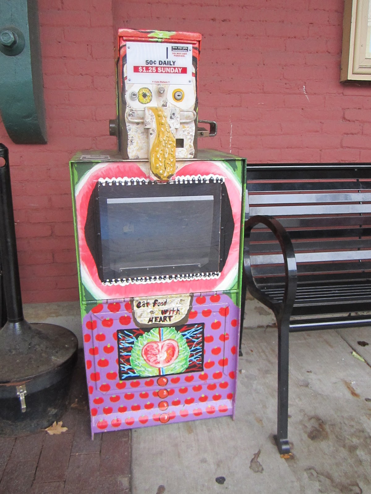
Another assignment in class, take an object and transform it.
This was the object before transformation :
 I did not know how to transform it; I was lost with these objects. I thought of breaking it and make something entirely different with the broken pieces, but I did not want to take a chance of not being able to put it back together. Then I took plastic wrap and wrapped it around the girl head and fabric for the boy. I was not pleased with what I have done to these head busts and want to discard it. I had my classmates critique my work and from these critiques one in particular came to my attention, "they look like their injured". I thought up of a new idea. I had decided to embrace the wraps, but I decided to use yarn for the wrapping.

Objects after using new material:

I did make a small hole on the head of the boy bust.  I also used wire to create the words "sight" and "blind".
I titled this project " Who's the Blind One?"


Why is it that the girl has "blind" over her face when it is the boy who has yarn wrapped around his eyes? Why is it that the boy has "sight" tangled into his yarn- wrapped face? Why did I make them the way they are right now? I always thought that blind people always had a sixth sense. Many people with perfect vision  judge a book by its cover and slip past the pages. Blind people READ the pages and get to KNOW it and then MAKE the decision if it is good or not.
This was my inspiration for my object transformation project.


I was deciding if I should take off the words written on the heads with sharpie because the printed words were already being taped onto the pedestal.  I thought that there was too much going on and there was no balance.  


The process of taping yarn onto the wall to integrate the pictures, the words, and the heads  together.


The finished look of my  work.


Notice how the heads do not have the written words.  It looks a lot better in my opinion.  


From this angle, the yarn creates a cool shadow pattern.  This caught my eye as I was going around to take pictures.
The process of making this was long, but it was a great learning experience.  I feel like I learned how to expand my ideas further. I originally did not plan to integrate the yarn onto the pedestal and the wall.  I also extended my ideas by deciding to tape the words onto the yarn, which gave it a cool dangling effect.  This process taught me how to take a further step from my original idea.

Blind Contour


Blind Contour, was another class topic of the day. Each student needed to partnered up with one other person. We needed to be sitting face to face and draw each other... without looking at the paper.
I am a visual artist, so blind contouring was a challenge.
I did have fun drawing blind and seeing how my drawing looked afterwards.
To be honest, it was pretty "disturbing" haha. The eyes would be located on her forehead or her nose would overlap her lips.  It was VERY difficult, but it was a fun process.

Examples of Blind Contour.


http://apple-pine.livejournal.com/


This is a drawing of a blind contour I have done in my art class.
I did not outline the whole thing in pen because I wanted to experiment on how the thin lines of a pencil and the thicker lines of the sharpie would look like as a whole.  I liked the contrast that both lines bring; although, I would have outlined   some areas differently, now that I have seen what I have drawn.  I would not outline the table in the background, but I would outline the rest of the hair. 


8 Hour Projects

The 8 hour project took place in the gallery and the pictures below show few of my favorite pieces.
When I looked at this piece, it felt nostalgic to me.  I remembered my childhood by looking at the pick colors of the glasses and band-aid.  Cara Erskine captures the childhood memories that most people experience or own in their lives.  

This piece reminds me of Tim Burton. Renee Ikes and Tim Burton uses dark colors  to convey their ideas.  Each character are drawn differently and each have a particular dark and sinister look.  This piece looks gloomy and a lot of Tim Burton's ideas convey those feelings to the spectators. 

I was disturbed by this piece because I could see the eyes,  ears, and arms of the stuffed animals that were ripped a part  to create this piece.  I did not witness the process, but I could tell that the process that Anna Kell took was related to the cruelty of poaching endangered animals and the process of skinning the animals.  It brought up feelings like anger, sorrow, and pity.  It takes one to wonder about the real-life situation going on with these animals and what is being done to stop it.  

I really liked how Catherine Mann could make a simple formation  and create many different images pop up.  For example, from afar you could see a mountain, polar bear, and a water fall.  


I could relate to the piece because Valerie Gilman and I share the same interest, which is using clay as a medium to create an art work.  I wish Valerie Gilman could have taken the extra step into completing the features of this man, but it could be meant to look unfinished.  This is still my favorite piece because I love sculptures made from clay and I love the realistic human features on this work.  

8 Hour Projects done by students at Allegheny College.
The pictures posted above are the ones that caught my interest. I love the colors, texture, and position of the pieces. I did not personally see how all of these were made, but I did enjoy the outcome. I love this picture (above), I love sculpting with clay and when I saw this piece it just called to me. It looks like a strong piece to me even though the artist may have not finished.  

Mind Maps

The first assignment in Art and Environment class.  I think I could add a lot more personal things into this mind map and make it more 3-dimensional.  When I started to draw my mind map, my mind went blank.  It's hard to sit and think about all the things you do in your daily life; however, it was a fun project and the process of making it was fun.

Go to link : http://www.rainydaymagazine.com/RDM2009/Home/September/Week3/RDMHomeSep1409.htm

This is my mind map that I have drawn in my art class; I love the result of my mind map; however, I would have liked to added more personal items and make it more 3-d.  I would have liked to use a different color or textured paper to make the paper crane that was put on the mind map.

Summer Archive

I wanted to paint, draw, and sketch as much as I could before I started art class this August.
I took a lot of pictures and documented as many things as I could.